How 2020 showed the real value of infographics
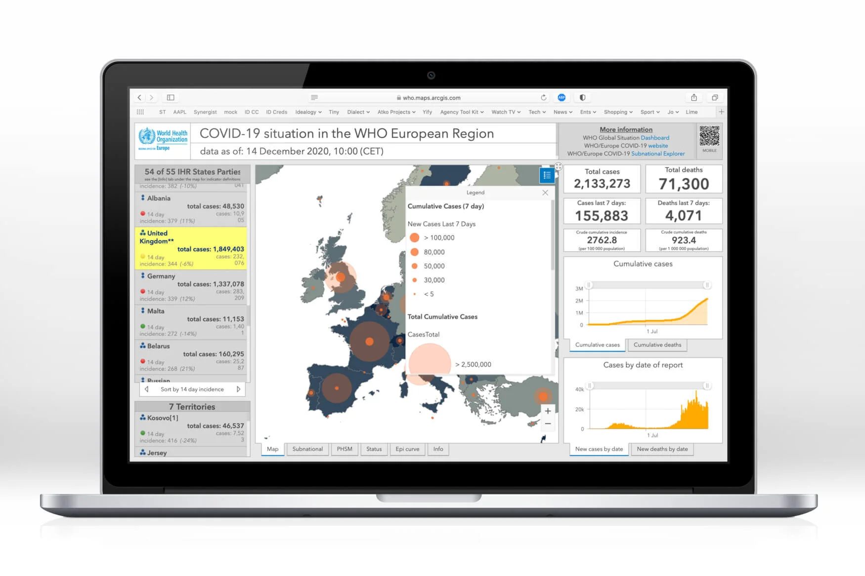
There’s been a lot of data to absorb in 2020. From localised Covid rules, to daily number updates, to global projections and not forgetting the weirdly gripping election where we all became electoral college experts.
One of the few positive things to come from this year, apart from a sane president, is that the world upped its infographic game. Some of the best are below.

Breaking the voting split down to accurately show people who voted and remove the misleading see of red.

